Rare. Very rare. Not even seldom that i would come here. It was a long time and nothing much that has been done. But i'm coming back..writing,always is my passion. My brain would scream at me....i cant just sit down and do nothing. Here i wish to do this, right now...right this moment..
1. watching quacking aspen
2. sheeps and horses farming in .....Patagonia (my fantasy-world)
So, what are you doing now? lets take a walk with me.
Friday, June 3, 2011
Saturday, September 18, 2010
Journey through time.....Series 1

Qouting this - “Behind closed eyes, colors fade and blend into beautiful new creations. Fate is left at the shaking hands of our imaginations. Places new and amazing, faces remain unseen. How, then, does our heart feel as if racing in the anticipation of a dream?”~ anon
“Let your mind start a journey thru a strange new world. Leave all thoughts of the world you knew before. Let your soul take you where you long to be...Close your eyes let your spirit start to soar, and you'll live as you've never lived before.” ~ Erich Fromm
Wisconsin ~ Madison, Illinois
Ouch!
I have stop blogging like forever. Nah, what else could it be other than hectic schedule trying to cope with classes and research........and yeah RESEARCH......So i have a wonderful summer, from Oval beach to fruits picking......and three months of mites performance study, Brava girl!!
Monday, June 8, 2009
Hidden Meanings?
What I found today has greatly triggered an adrenaline and rushed the blood. Such hidden or secret symbol all behind these popular brands are meaningful. This shows the role the creativity placed in 20th century. Creativity reflects the pulchritude of an inner thinking, no doubt. Qouting WallPop.com " Sometimes a company or brand logo is more than it first appears. We take a look at the hidden meanings or messages embedded in popular logos. You won't look at these designs the same way again" (Resources AOL).
Here come the lists:
1. FedEx
Can you spot something in this logo? The FedEx logo, designed in 1994 by Linden Leader & Landor Associates, at first appears simple and straightforward. However, if you look at the white space between the "E" and "x" you can see a right-facing arrow. This "hidden" arrow was intended to be a subliminal symbol for speed and precision.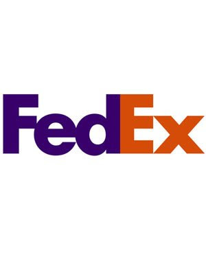
2.Amazon.com
That yellow arrow is more than just a decorative swoosh. The Amazon logo was created to represent the message that it sells everything from A to Z (the arrow connects the two letters) and also represents the smile that customers would experience by shopping on the Amazon.com Web site (the arrow becomes a smile).

3. Baskin-Robbins
In 2005, as part of its 60th anniversary celebration, Baskin-Robbins launched a new brand identity. The new logo was intended to "capture the fun and energy of Baskin-Robbins." In the old logo, the number "31" appeared within a simple arc, suggestive of a scoop of ice cream, and next to the name. In the new logo, you can see that the "31" still exists. It is now formed by the pink portion of the ice cream store's two initials: "B" and "R."

4.Big Ten Conference
Founded in 1896, the Big Ten Conference is a union of world-class academic institutions who share a common mission of research, graduate, professional and undergraduate teaching and public service. From approximately 1949 until 1990, the Big Ten consisted of 10 member schools. Then, on June 4, 1990, it added Pennsylvania State University into the Conference. The "Big Ten" name stayed the same, but if you look closely at the blue space surrounding the letters "G" and "T", you can clearly see the number "11" reflects this addition.

5. Toblerone
In 1908, in Berne, Switzerland, Theodore Tobler and Emil Baumann (Tobler's cousin), developed a unique chocolate, consisting of a special recipe and a triangular shape. But it wasn't until 1970 that the Matterhorn mountain image appeared on the packaging for the first time. Today there is a bear (symbol of the city of Berne, where Toblerone is produced) hidden in the modern version of the Matterhorn mountain logo.

6. Northwest Airlines
Lamenting the loss of the old Northwest Airlines logo (shown here), pilot Patrick Smith published his critique of the new logo in his "Ask the Pilot" column at salon.com, saying the airline's previous circular corporate logo was, "quite simply, a work of genius. It was an N; it was a W; it was a compass pointing toward the northwest."

7. Sun Microsystems
Sun's logo -- which features four interleaved copies of the word "sun" -- was designed by professor Vaughan Pratt of Stanford University. It is an ambigram, which is defined as a typographical design or artform that may be read as one or more words not only in its form as presented, but also from another viewpoint, direction or orientation. The initial version of the logo had the sides oriented horizontally and vertically, but it was subsequently redesigned so as to appear to stand on one corner.

8. Families and Marriage Magazines
The "i's" in Families and the mirrored "R's" in Marriage visually symbolize both relationships simply and effectively.

9. Goodwill Industries
Do you see the right half of a smiley face? Or do you see a lower case "g"? In either case, you'd be correct.

10. Unilever
According to Unilever, its new identity is an expression of vitality. Each icon within the logo represents an aspect of its business. For example, the shirt (below the heart) symbolizes "clothes" and represent fresh laundry and looking good.

11. Carrefour
The Carrefour group is one the world’s leading distribution groups and the world’s second-largest retailer and the largest in Europe. As explained by graphicdesignblog.org, Carrefour in French means "crossroads" and the logo shows two opposite arrows inside a diamond shaping the "C" letter with the negative space between them.

12. Hartford Whalers
Take a look and you'll see a whale's tail, the letter "W" in green and the white space forming an "H" for Hartford.

13. IBM
According to the IBM Archives, in 1972 the IBM international recognition logo was adopted and remains the official logo still in use. The IBM logo is easily recognized by the distinctive eight stripes that make up the letters IBM. The horizontal stripes are intended to suggest "speed and dynamism."

14. Galeries Lafayette
The flagship store of Galeries Lafayette is in Paris and is a 10-story department store. Which is why it makes perfect sense for the the logo's two "t's" to join to form a representation of the Eiffel Tower.

*Resource credit goes to www.walletpop.com
Creativity is an open source. That is my thought.How to cherish creativity in one-self? I adores much of the work done by people who seeks and endavoured to creative thinking and design. Sir Ken Robinson, Cameron Sinclair, Bell Hook (to name a few) whose credits are upon them.
~ Ly ~
Monday, May 4, 2009
Tulip Time


 Confession of the art - more like a random snap!


 Do you spot any of the bug here?

 Nah, wooden shoe of Dutch
 I catch tulip in my dream , they are bugging!
 Tulips that are mesmerizing
Love. Love. Love the tulips. Woman and flower are synonime, a perfect match. A recent trip to Holland remind me of a down memory lane.
~Tulips retro~ Lynn
Subscribe to:
Posts (Atom)
